

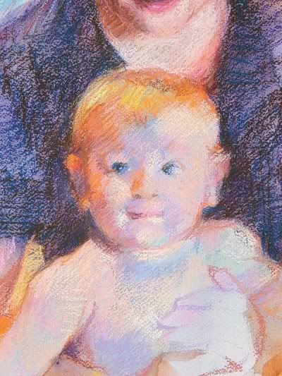
The skin of our young man is built mostly of the palest of pales: pale green-blue, sky blue, lavender, pink... etc. As long as the value is right, the picture will be believable.
In the good old days, the calcium carbonate extender - heck, really NOWADAYS is worse - that is added to the pure pigment to give it body, was inconsistent and often went too transparent or too opaque. In lightening the color it did not provide a stable appearance and that is why a lot of people don't use fixative. The pale colors were easy to mix in those delicate shades...just add white!
I use hard pastel specifically because they tend to be more robust and heavy on pigment and not on the white or "chalk" that people mistakenly call these sticks. I find a light hit of a really good workable fixative (Winsor & Newton is my ultimate fave! It smells of Witch Hazel, how cool!) and it will not cause these dense colors to sink. There is no more discouraging event than having a beautiful piece ready to send to the framer and spritzing it to find all the lights went invisible! The inconsistent quality has given fixative a bad name.
I use fixative along the way. In fact the above step, was lightly misted which allowed me more room to add a bit more light colors on top of the slightly darkened pales. I work 80% in hard pastels before I bring out the big guns. That being the precious (and they are worth it) well made, clear colored soft pastels. BUT often they are done after a final spray of fixative and usually only the very lightest lights! It is the nature of the beast to moisten and re-constitute into a mixture of colors. High quality (I LOVE TERRY LUDWIG) soft pastels may, upon adding a damp fixative, merge down in value. So I try my best to stabilize as I go. For the sake of my framer!!!
A closer view of the face:
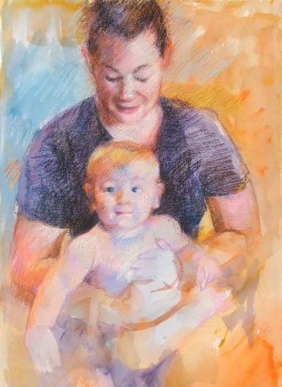
The bulk of the work now is to build up values and relationships.
That shirt, which I hid the blacks from myself, is growing darker and darker with my three and only three dark sticks. At times, I am actually dragging much more middle value colors into it to keep it from having the appearance of being cut out from behind the baby.
I have to redraw and work on the original placement of things. Mom's arms are becoming problematic at this point, as I get too involved in the bright oranges of her skin, I have to be sure that that really neat little triangle on the left arm is no smaller or larger than it needs to be for the arm to end up connecting properly to her hand!
Big finish next time.
dj*
No comments:
Post a Comment