About Me

My photo
Portrait artist, fine artist, educator, student. Trying all means to keep from getting a day job in the tough times, but still supporting myself as an artist! deejaystar@yahoo.com Follow any and all of my blogs. THANK YOU!

Thursday, October 15, 2009

The Frugal Pastellist Gets Some CASH!

I just found out that I have won the first place prize in Pastel at the Arizona State Fair!
My piece - Highland Major, Minimus - is 20x16" on watercolor paper with watercolor under.
I will be demonstrating the technique at the Fair for opening day Friday at 1 pm. Our artist's reception is next Tuesday and I will be hanging out with the crowd, shaking hands and chatting! Feel free to hit the Fairgrounds in Phoenix and come by and say hi!


Wednesday, September 9, 2009

Early Notice, I am giving a class.

For the locals (or for anyone interested in hiring me anywhere) here is a preview of my class.
I will be doing a three day workshop covering the same subject in Prescott AZ next May, but you will hear more of that! Click to see it bigger....


Tuesday, September 1, 2009

Got the Blue Ribbon!

Whew. It didn't realize how really obsessed I was with this little show!
I had Lucy and Milo framed and kept thinging of things to improve it! I pretty well resigned myself to having enjoyed the process...... but it paid off.

Got the Blue Ribbon!

No real prize money. Hanging in a local church for a month and back home, but I guess I did my homework well and someone noticed!
dj*

Saturday, August 29, 2009

Girl in the Yellow Dress - Finish

I started playing with all my yellows. And being FRUGAL, I didn't have many. A pale gold, a bright lemon, a bit of ocher. I also decided right away to put in the pink and the highlight on the cheek. The painting is all about that wash of light across her dress.


First thing I started to see was that my darks were not going to hold up against the yellows.

Throwing in some more of the tones on the skin and dress, I decided to paint in more of the underpaint. Heck, it will end up black, so I put some real black in.

A much stronger contrast to the foreground.
So it is time to start working on the details:


Once the dark is established, the rosebuds start to pop and the depth of space starts coming up.

I really am not as happy with it as it comes to the end. It starts being a matter of just tweaking. I really think I will stop adding so much color on a few pieces and see if I like them more. I love the looseness and texture... but there are still things that need fixed.


Everything is pulling together. It is tricky, I see from the photos, but I did tone the skin down using a bit of a neutral violet that would kill the bright pink and even the tone out a wee bit. There are a lot of fiddling differences between the pictures. As you see the garden is blooming and I am trying to force that light on the dress up closer to washed out light.


Comparing the values in the original show how much improved it is by painting (;-) ). I tell my clients how much photos can lie. But the amazing thing about art is how much more you can SAY, not even SEE with an image. It is not about reproducing the picture, but reproducing the mood that the image evokes.

The finish is not as crisp as the progress pieces, but this is where it ends. I think I achieved the nostalgia and sense of place I was going for:


dj*

The Girl in the Yellow Dress - Planning

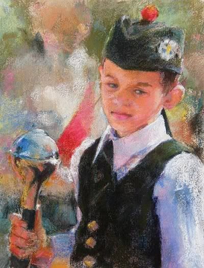
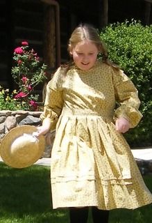
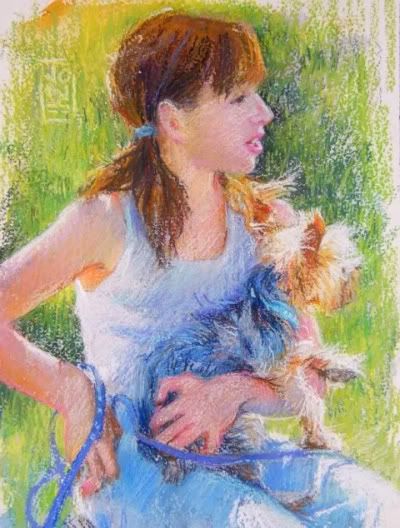
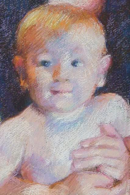
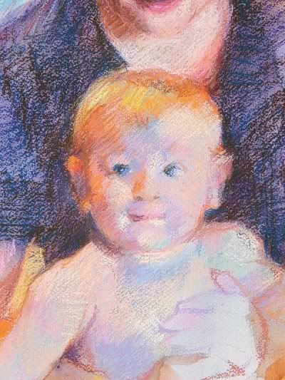
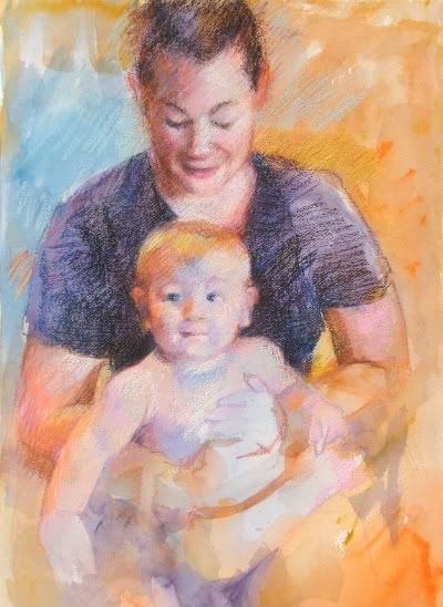
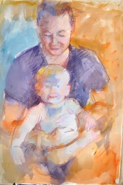
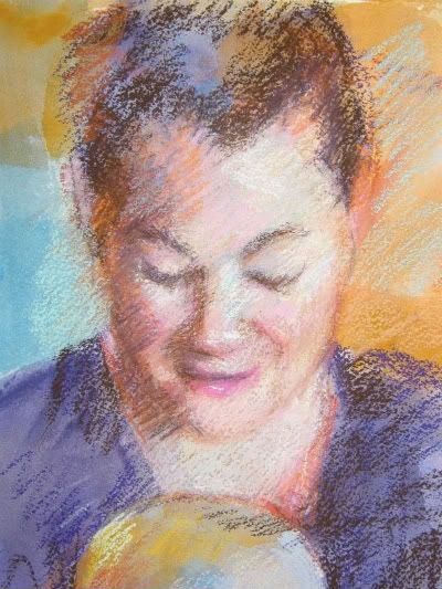
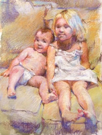
On a trip to Prescott Arizona to visit the Mountain Artist's Guild where I will be giving a workshop on my pastel techniques, I spent part of the afternoon in a historic part of town where children in period dress, played with hoops and croquet mallets! A perfect opportunity to snap a lot of marvelous reference for some nifty paintings.

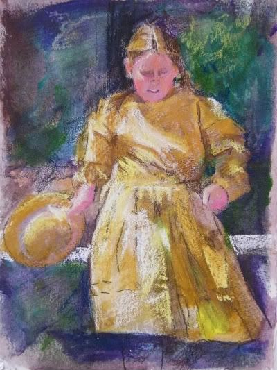
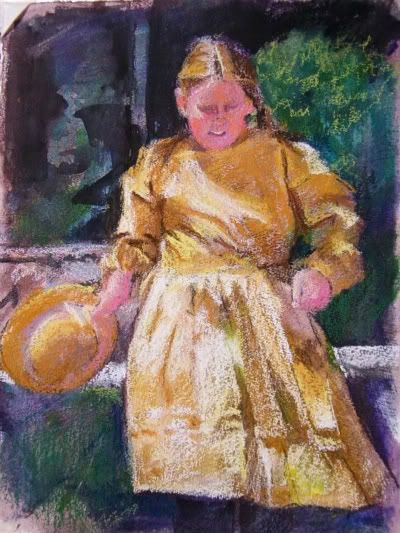
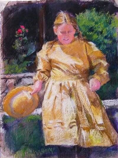
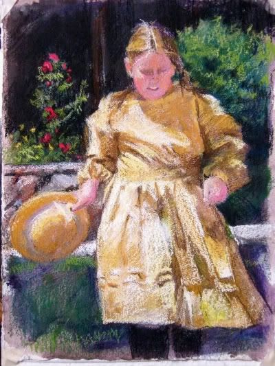
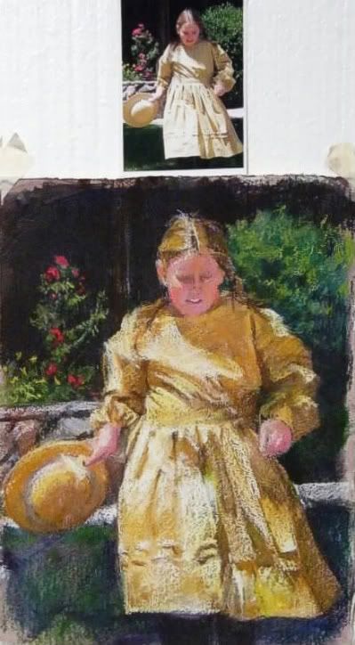
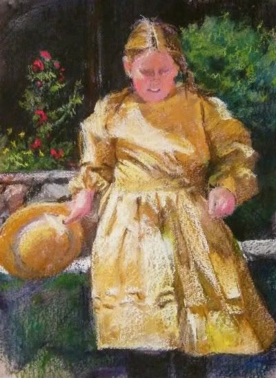
My girl, with her straw hat and golden hair, was walking out of the shadow of her porch into the sun drenched day.
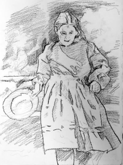
The first order of business is to make a basic drawing which will help me understand the areas that will stay light and go dark. The "cartoon" is what they called it in the good old days, is the most basic of basic notes to myself as the artist. This drawing of notation is not as easy as it looks.

Many artists will grid up a drawing, using squares which one super-imposes on the reference to match LARGER squares on the drawing. It is a bite size chunk approach of making something big and complex, smaller and manageable.

Others use projectors, either old fashioned slides, small opaque projectors or other fancy tools.

Still others reprint the photo is sections to the exact size they will be drawing.... the TRICK is to make useful lines.

Some of my students will outline everything they can imagine. The key is imagine! Lots of what is in the reference is not actually visible. A real problem is often an eye, that will end up outlined and pupil and tear duct all shown, when the actual photo is merely lights and darks.

A really useful sketch should help you abstract the areas of light and dark, and let you sort o short hand your soft and hard edges. AS THE ARTIST, you should always... one of my pet peeves.... always have some idea when you start, how you will end. I tend to be a bit A.D.D. in things so when I start, I often skip way ahead and dive in quickly, but I will say, my very BEST work may not ACTUALLY have a color sketch or plan, but there are hours spent on my computer playing with values and colors before I pick the aspects of the picture I want to do.

So this final drawing was done, not directly from the picture, but from tracings to ELIMINATE things. The less detail in the underdrawing, the stronger the shapes and masses, the better it functions:

The lighter drawing done in vine charcoal, is reinforced with compressed charcoal. When I have played my strategy in my head of what I am going to do next, I spray it to secure it with a fixative. And as you know, there is a reason for this.

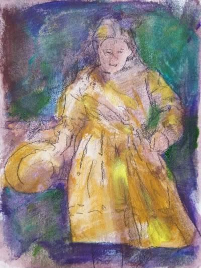
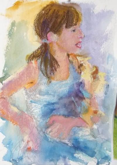
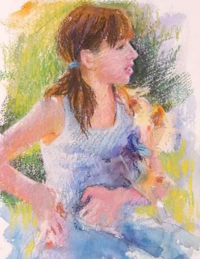
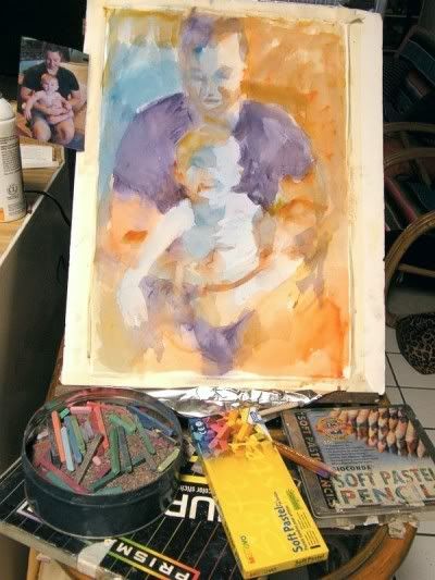
In this piece, I will use my underpainting to get a running start at some of those darks in the shadows behind. I am also not going to get too creative in my use of complements. I am going to use yellow in yellow and splashes of local color mostly to give a lot more vitality to the yellows of the picture.

The general look of the underpainting, which began with a sludge of all over burnt sienna left some of the white of the paper for the whites in the dress and just builds darker tones to start with.
Not a very pretty sight.... Glumps of color and pretty insipid. YOU are not the only ones anxious to see me put color in...

As much as I hate to break this up upside down again, I think it is best to publish as I go. I might finish it tonight, but more fun letting you read so far!
dj*


Wednesday, August 26, 2009

The Girl and the Yorkie

I have been doing a dog blog, and in the middle of it, I became obsessed with pastels again. Between cute kids and dogs, one has a lot of latitude, so I did a cute kid with a dog.

Here we go again. The paper this time is a block of rough watercolor paper that was acquired for me at a yard sale by one of my minions who like to buy grab bags and drop them off!!! (He got me a great new easel and some amazing old Old Holland oils too, sigh, I love friends!!)
This is 9x14...one of the dangers of odd yard sale finds is that they are MORE non standard than the usual watercolor block!


Our goal here is a white t-shirt with a scruffy grey dog. I am going to use a lot of dark blue for the gray in the dog, so a mass of purple right there in the middle is a good choice to make the lights sing.

Like I did with the previous post, I just begin finding color matches. NORMALLY I would key the lightest light, to the deepest dark, but I had sort of lost my way here. I started dark first and it is a lot more work. Marking in the hair and colors on the very rough surface makes for a bit of a challenge.

But you can see how the pinks are beginning to define the flesh over the stripe of cool in the arm.

One of the nice things about creating your own color base is that you can make a dark surface against which to play your lights. I was not doing well (I will admit, this started with no real plan. IT MAKES A LOT OF DIFFERENCE WHEN YOU PLAN!!) for fear my flesh would go way too dark, and I didn't like how the face was starting.... so I did magic!

When you are using two mediums to get your effects you can do even more magic: I used a fine brush and diluted the pastels to cut a sharp dark edge on her profile. My reference had a light face in shadow against a dark background figure and I liked that face....


Literally I was painting with my pastels... some dark blended here and there. NO MORE PAINT but using the pastels a bit like watercolor pencils. So then I started playing into the dark background. As you see, the pastels are clunky and clumpy which is random, but makes for a lot of interesting variety in surface and line. I also wanted to deal with a lot of halo and backlighting for them both, so the background had to show more contrast... note the strong light on top of her arm, wisps of hair and the top of the dogs head. All of these twinkle of color reflected the strong daylight from behind.

The final result has a bit of changing in the background, and the loose stroke, I think suits the cute little terrier in her arms.

The big finish!
dj*


Tuesday, August 25, 2009

FRUGAL NOTE

Just because I started the blog to brag how cheap I am....
This is over at the framer now. I have a great guy who does back flips for me. One of the best ways to save money is on your framing.
1. LET THE CLIENT FRAME IT!
the very best way when doing commissions. I never estimate a piece, no matter what, to include the frame. I will hand deliver it to the framer and let him take it from there, adding the cost after payment is received. NOT MY JOB

2. Work in a standard size.
If you are going to have to hang it on a wall for a while visiting, it really is hard to make a choice between a lot of money for very good show, and generic to let the piece show. Standard sized frames on sale, load up, have handy and work TO a size. Framing is always a sticker shock.

3. Establish a rapport with a framer and see what the scrap pile looks like.
My guy often goes through his molding ends and puts little standard frames together which he sells at a real discount. I still cover the glass and matting, but even if I pulled down my mat cutter, a PRO is going to be worth the money.

4. Slide 'em in, slide'em out.
I have this getting framed for a show on Tuesday. I asked the framer not to seal the back like he usually does, so I can remove this, as the odds of selling are pretty low, and recycle the show frame for other shows.

Frugal note done.
dj*


Finish of Lucy and Milo

Sometimes I feel I get a bit wordy, so sometimes it is just time for a picture.
This is the whole thing done:


with some close ups:

You can see all the underlying colors both in paint and pastel and how they blend optically to make a rich flesh.


My intention was to make a stylistic and thematic interpretation of Mary Cassatt. I am so close. My strokes are nowhere near approaching the confidence I had hoped for, but subject and color use, I feel much closer.


Next demo is a generic ME... sorry, I am trying NOT to be too compulsive and post when I feel like it - not turn it into a chore.

So, I will try to do the next one all at one time.
THANK YOU FOR LOOKING!!
dj*


Sunday, August 23, 2009

L & M Pt. 3

The skin of our young man is built mostly of the palest of pales: pale green-blue, sky blue, lavender, pink... etc. As long as the value is right, the picture will be believable.

In the good old days, the calcium carbonate extender - heck, really NOWADAYS is worse - that is added to the pure pigment to give it body, was inconsistent and often went too transparent or too opaque. In lightening the color it did not provide a stable appearance and that is why a lot of people don't use fixative. The pale colors were easy to mix in those delicate shades...just add white!

I use hard pastel specifically because they tend to be more robust and heavy on pigment and not on the white or "chalk" that people mistakenly call these sticks. I find a light hit of a really good workable fixative (Winsor & Newton is my ultimate fave! It smells of Witch Hazel, how cool!) and it will not cause these dense colors to sink. There is no more discouraging event than having a beautiful piece ready to send to the framer and spritzing it to find all the lights went invisible! The inconsistent quality has given fixative a bad name.

I use fixative along the way. In fact the above step, was lightly misted which allowed me more room to add a bit more light colors on top of the slightly darkened pales. I work 80% in hard pastels before I bring out the big guns. That being the precious (and they are worth it) well made, clear colored soft pastels. BUT often they are done after a final spray of fixative and usually only the very lightest lights! It is the nature of the beast to moisten and re-constitute into a mixture of colors. High quality (I LOVE TERRY LUDWIG) soft pastels may, upon adding a damp fixative, merge down in value. So I try my best to stabilize as I go. For the sake of my framer!!!

A closer view of the face:


The bulk of the work now is to build up values and relationships.
That shirt, which I hid the blacks from myself, is growing darker and darker with my three and only three dark sticks. At times, I am actually dragging much more middle value colors into it to keep it from having the appearance of being cut out from behind the baby.

I have to redraw and work on the original placement of things. Mom's arms are becoming problematic at this point, as I get too involved in the bright oranges of her skin, I have to be sure that that really neat little triangle on the left arm is no smaller or larger than it needs to be for the arm to end up connecting properly to her hand!


Big finish next time.
dj*

L & M pt. 2

ONE problem with blogs is that they sequence bottom to top.  I suppose I may join all the posts together when I get them up, but it is confusing when trying to show you a process...

So, last I had the basics of Lucy's head and skin.


Her adult skin tone was illuminated in interior incandescent from above and a flood of sun from the window on the side.  The two light sources are great for a color project.  Most of the light on my pink Milo belly will be the cooler tones that make for the un-tanned baby flesh I am dying to get into.


The blue splash under the skin tones, as you saw in the close up of Lucy, faintly colors the whole tone.  Building contrasts with more darks in the shirt against the shapes, and bringing colors from the background into the ears, and below the next, help break the isolation of the figures.  Light is what we use to see things, light is what helps us understand, and in art, bringing a sense of that light into areas near each other, gives a much more unified look.

I am trying very hard (not as successfully as I had hoped) to decrease the emphasis of line as the drawing.  Yep, the whole thing IS line... scratches and marks, skinny little lines, but they are being used for what pastels to the best:  building color next to pure color.  Much like pointillism.  The actual color that the eye understands ends up a mixture of all of those presented... so it looks like skin, even if it s blue and green and purple.


To that end, you will see I have reinforced the outlines of the hands and fingers, not with black or charcoal, but a nice low chroma lavender.  With luck I will let them stay light.


Milo is fleshing out.    I used my dark blue, deep Russian-like, and some of the light blue for the whites to show the contrast in the eyes.  I am trying to make a figurative, not a portrait painting here.  

I find I have a situation in my art.  I LOVE to do portraits.  I love to capture the essence of people and things, showing a lot more than appearance, but personality.  THIS picture is an attempt to directly learn a bit about the use of technique and feeling of the Mary Cassatt painting and keep myself within my own restrictions.  Milo is a great looking kid... and neither he nor Lucy actually look LIKE Lucy or Milo.  When I get the painting done, I will labor more on the likenesses if the subject thinks it is worth it.
I think I have a problem with this aspect of painting people because I am SO intrigued by the person.  I call it "Who wants to have a stranger watching you eat?"  I mean, while pursuing the likeness of people, I find their general appeal often is reduced.  To keep trying for the specific over the universal can eliminate a potential market.   Followers are REALLY WELCOME to post comments to support or deny me....
More to come....

Saturday, August 22, 2009

Lucy and Milo

My friend Lucy and I spent a great afternoon snapping away like Paparazzi, getting photos of real kids doing real things. Mostly fidgeting and fighting... and being very very sweet.

The reference for Milo and his mom looked very Madonna and Child, and... as luck would have it... very Mary Cassatt.

My art league is having a contest called "In the Manner Of..." and I toyed with some Winslow Homer ideas in watercolor but the more I looked the more I was not up to the task. So these great pink children inspired my attempt at Mary Cassatt, who along with Degas were the two memorable Impressionist pastel painters. Mary was well known for her mothers and beautiful half naked kids! So Milo and Lucy were my inspiration.

This is not my first try. I will show that in another post, but this larger piece on 1/2 sheet of 140# watercolor paper, donated to me by Lucy from a stack of paper her mother, also an artist, had left her. Taped and sketched, I use my old set of Marie brand watercolors, found by a friend in a rental they had cleaned before leasing out!! The low quality of the paints is actually part of my process.

When I plan an underpainting, I try to think where I want to use complements and where I want to support the color. In this piece I knew I had to back off my values. The charm of the Mary Cassatt images was a flat flood of daylight over pink juicy baby bellies! No black and only one brown stick would I use...

Thinning the paints and loosely painting under the colors, not really sticking to the drawing, I like to make color passages under where the pastels will go.

Here is the underpainting:

You see my basic set up. There are the NuPastels, pastel pencils, a tin full of rice to clean them and a small inexpensive but really nice quality soft pastels that I like to use to juice things up.
I like to store the long sticks, the green sticks, the less than used extra sticks in the rice. This, as you can see, is very well used. I throw the dirty sticks in and shake them up and most of the stray dust falls off and I find that I have MANY LESS BROWNS and a lot more lovely bright colors. My box contains most of my favorite small sticks, broken and somewhat organized to use easily an portably.
The underpainting was designed to keep a long cool tone through the baby, and a dark, but colorful contrast in the mother's shirt. Although it was black, my first attempt featured it much too strongly and I was determined to use no black in this. My darkest darks were mixtures of dark indigo, dark burnt umber and deep purple sticks.
I start by seeing what areas I need to redraw and will put in scrubs of light next to dark colors to establish value ranges..
I wanted to be sure there were very few outlines and strong hard edges. Finding Mom's eyebrows and placing them all in proportion were important, but as you see, the hair is starting in violets and browns.
I then try to build lights and darks, trying to keep the colors less relevant that their values. I use very light blue-greens, and yellows along with lavenders and pink in the skin tones. Colors that need dulling and brightening will be lightly hatched with white or gray that can lift it to the proper tone. This hatching and over hatching creates a blended surface, full of color.


I will show how I draw and redraw and pull the values into the baby's pink belly in my next post.
dj*


Friday, August 21, 2009

The Lucy Series

I have been covered in furry friends for a year now. I paint in the shade on the bench at the Scottsdale Off-Leash Dog Park when the weather is more favorable, and have worked on my blog documenting that since Thanksgiving.

Recently a few friends have helped me refresh some creative juices by volunteering to charge up my portrait (human) portfolio. The first group I want to post start with my friend Lucy and her marvelous kids, Kate and Milo.

I have observed that most portrait painters have a few glowing white-clad babes in their book. I love kids, but they are much like dogs. You do them a disservice by having them stiff and posed. They need energy and personality. Milo is a perpetual motion machine and Kate is a movie star.

I have plans to do a large oil of Kate, but the photo shoot and enthusiasm kept bringing me back to their images.

My first demo is not the first picture, but I want to show the short version of my watercolor paper technique.
The frugal part is the use of NuPastel. I am somewhat admired by people for my ability to squeeze out a monster range of color from these easy to buy, easy to use, relatively inexpensive hard pastel sticks. I like to blend color over color and use a lot of gray sticks to expand the range of the 48 or 92(?) colors in the box.

The second frugal part is the box of paints. I have a bucket of old acryics and watercolors that are drying up, taking up space, ready for the dumpster... but NOOO! I use them to make an underpainting for the pastel to follow to stretch the impact of the pastels.

The unfrugal part is my addiction to 300# watercolor paper. MOSTLY donated or scraps or the back of bad pictures, but I just love the stuff....

Above is a finish of Milo and Kate that was done in the technique. I THOUGHT I had my progress shots, but apparently not... so this is only what it ends up looking like.  Demos to follow!
dj*

The First Post

This is my first posting in the blog.

I am a portrait painter and you can usually find me on blogger at my Dog A Day Artblog, an experiment in discipline. I committed to posting one dog portrait a day for at least a year. I am more than 2/3 through it and happily, can say there is a puppy face for every day since Thanksgiving!!!

BUT.

I am proficient in not only many subjects, but a lot of media. I have a number of workshops coming up in Arizona and out of state featuring my techniques. MOST of them based on working cheaply!

I am going to feature more narration on this page than my other blog so I may delete and regret more. I am not going to try to keep any strict posting schedule, but I encourage viewers and students and other artists to engage me in dialogue.

I have decided the blog will give me a good outlet to pick my own brain as I make pictures. As a teacher, I have always found I see a look of lobotomy in my class when I get on a tear! TOO MUCH INFORMATION seems to flicker in their eyeballs. I am hoping that this blog might be a way, after the workshops, for my students to let the information trickle in, after the demo, in a more gentle and less brain jarring manner.

So, in the cabin-fever summer here in Scottsdale, Arizona, I begin my diary.

Posts may be works in progress, dissections of old pieces, critiques of other artists or students.
We shall see!