About Me

My photo
Portrait artist, fine artist, educator, student. Trying all means to keep from getting a day job in the tough times, but still supporting myself as an artist! deejaystar@yahoo.com Follow any and all of my blogs. THANK YOU!

Sunday, March 28, 2010

My Class in Mesa

Because I am starting to promote my class this summer in Prescott, I figured I would post a little of some of my work in a class I teach every week in Mesa Arizona. This is a great group of exceptionally talented Seniors (and just under) who have figured out how to keep their homes tidy and come out every Wednesday for a casual paint-together. I pick up after lunch with a group I call Art Coach. My only goal is to HELP IMPROVE THEIR WORK. I try hard not to teach, per se, but to understand what they want to accomplish in their own work and demonstrate for an hour some technique of mine that they can use or ignore.

This month I started with a very brief version of the Pastel Over Watermedia. Much like my demonstration will be at the Mountain Art Center at the end of May.

I used a cold pressed watercolor taped to a chunk of foam core. It was a revelation! I was taught to put a pat of newspapers under the paper for than nice bounce that makes pastels push much better than on a hard surface. Fit my easel and was nice and soft.

After sketching from my photo, I make sure the resulting drawing DEFINES THE EDGES that I need to keep track of as the painting progresses.

The less lines the better. It is going to get lost anyway! Because I am going to saturate and scrub the under-painting, I did use some workable fixative but this was in graphite. Graphite has a lot of durability that charcoal does not. It is a bane in oils and slippery but when you see what we do with it, you understand.

Next I scrub... and I LIKE to scrub... my under-painting of inexpensive acrylics. I use up the old and nasty stuff for this. I also like it, because I keep throwing out the hard and dead tubes as I prep for the demonstration. One can acquire a few too many paints.

In the class I explain the under-painting does three things: Individually or all at once, the colors you put on can support the values, by darkening areas that you want to go dark, complement colors for extra vibrancy or intensify a color using analogous hues. I have done a little of everything in this:

I ran into the ladies room (because I forgot my hair dryer) and using the hand dryer in there, made sure all the water was out of the paper. This works best when SCRUBBED into the surface. This demonstration came out much lighter than I had intended so I will have a darker general appearance, as I have to build up darks to give the appearance of lighter. (I use inexpensive NuPastels for about 85% of the piece before the light bright soft pastels, and the contrast is what makes us see light and dark.) THEN I reinforced the drawing with compressed charcoal or pastel.

Even light edges that touch other light edges but have major color changes are good to map out. My other trick is a transparent tracing paper sketch that can flip back and forth to correct from. As a solo painter, it keeps me from walking over to visit the neighbors in the middle of the night for a fresh eye!!!

Class began progressing and I talked a bit and forgot to shoot much, but the first thing I did above was limit my value range by finding the lightest part of the painting - in this case her eyes - and the darkest part near by. I make a note with a stick and DON'T ever use white or black. In this case it was a yellow butter color and green.... yes I used great for her blue eyes, because it was dark.... then I started trying to lay in my shadows and general tones.

I endeared myself to the class by admitting I goofed! The sticks I had on hand were ALL very middle values. Few strong darks and almost no light flesh tones. I got to show how to improvise.

If you don't have the right stick, you can literally mix colors. In the light areas of the skin, I used a lot of that buttery yellow OVER the darker pinks to actually make lighter colors. When the colors are too strong but you don't have the proper gray tones, or too light or even too dark, a good five or six simple gray sticks will work to lower intensity and control values. Using colored lights AND a light gray I was able to start blending up in the skin while beginning to darken the shadows with browns.

At the end of the demo, I was able to sit IN FRONT of my piece and start rethinking some of the drawing issues I had lost with the initial chalking in.

The gang went wild. I must say I was over at the sink encouraging splashing and slopping of the under-painting and that fear of losing the image was very intimidating, but it was quite well received.

Next week, I will try to finish up and show how to use fixative as a tool and when to hit the big guns (and money) with the buttery soft pastels. I could see their brains start to wrap around the idea in the students that attempted it

Back next week or next pastel!

Thursday, October 15, 2009

The Frugal Pastellist Gets Some CASH!

I just found out that I have won the first place prize in Pastel at the Arizona State Fair!
My piece - Highland Major, Minimus - is 20x16" on watercolor paper with watercolor under.
I will be demonstrating the technique at the Fair for opening day Friday at 1 pm. Our artist's reception is next Tuesday and I will be hanging out with the crowd, shaking hands and chatting! Feel free to hit the Fairgrounds in Phoenix and come by and say hi!


Wednesday, September 9, 2009

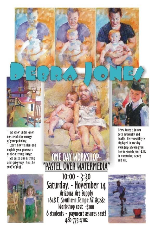
Early Notice, I am giving a class.

For the locals (or for anyone interested in hiring me anywhere) here is a preview of my class.
I will be doing a three day workshop covering the same subject in Prescott AZ next May, but you will hear more of that! Click to see it bigger....


Tuesday, September 1, 2009

Got the Blue Ribbon!

Whew. It didn't realize how really obsessed I was with this little show!
I had Lucy and Milo framed and kept thinging of things to improve it! I pretty well resigned myself to having enjoyed the process...... but it paid off.

Got the Blue Ribbon!

No real prize money. Hanging in a local church for a month and back home, but I guess I did my homework well and someone noticed!
dj*

Saturday, August 29, 2009

Girl in the Yellow Dress - Finish

I started playing with all my yellows. And being FRUGAL, I didn't have many. A pale gold, a bright lemon, a bit of ocher. I also decided right away to put in the pink and the highlight on the cheek. The painting is all about that wash of light across her dress.


First thing I started to see was that my darks were not going to hold up against the yellows.

Throwing in some more of the tones on the skin and dress, I decided to paint in more of the underpaint. Heck, it will end up black, so I put some real black in.

A much stronger contrast to the foreground.
So it is time to start working on the details:


Once the dark is established, the rosebuds start to pop and the depth of space starts coming up.

I really am not as happy with it as it comes to the end. It starts being a matter of just tweaking. I really think I will stop adding so much color on a few pieces and see if I like them more. I love the looseness and texture... but there are still things that need fixed.


Everything is pulling together. It is tricky, I see from the photos, but I did tone the skin down using a bit of a neutral violet that would kill the bright pink and even the tone out a wee bit. There are a lot of fiddling differences between the pictures. As you see the garden is blooming and I am trying to force that light on the dress up closer to washed out light.


Comparing the values in the original show how much improved it is by painting (;-) ). I tell my clients how much photos can lie. But the amazing thing about art is how much more you can SAY, not even SEE with an image. It is not about reproducing the picture, but reproducing the mood that the image evokes.

The finish is not as crisp as the progress pieces, but this is where it ends. I think I achieved the nostalgia and sense of place I was going for:


dj*

The Girl in the Yellow Dress - Planning

On a trip to Prescott Arizona to visit the Mountain Artist's Guild where I will be giving a workshop on my pastel techniques, I spent part of the afternoon in a historic part of town where children in period dress, played with hoops and croquet mallets! A perfect opportunity to snap a lot of marvelous reference for some nifty paintings.

My girl, with her straw hat and golden hair, was walking out of the shadow of her porch into the sun drenched day.
The first order of business is to make a basic drawing which will help me understand the areas that will stay light and go dark. The "cartoon" is what they called it in the good old days, is the most basic of basic notes to myself as the artist. This drawing of notation is not as easy as it looks.

Many artists will grid up a drawing, using squares which one super-imposes on the reference to match LARGER squares on the drawing. It is a bite size chunk approach of making something big and complex, smaller and manageable.

Others use projectors, either old fashioned slides, small opaque projectors or other fancy tools.

Still others reprint the photo is sections to the exact size they will be drawing.... the TRICK is to make useful lines.

Some of my students will outline everything they can imagine. The key is imagine! Lots of what is in the reference is not actually visible. A real problem is often an eye, that will end up outlined and pupil and tear duct all shown, when the actual photo is merely lights and darks.

A really useful sketch should help you abstract the areas of light and dark, and let you sort o short hand your soft and hard edges. AS THE ARTIST, you should always... one of my pet peeves.... always have some idea when you start, how you will end. I tend to be a bit A.D.D. in things so when I start, I often skip way ahead and dive in quickly, but I will say, my very BEST work may not ACTUALLY have a color sketch or plan, but there are hours spent on my computer playing with values and colors before I pick the aspects of the picture I want to do.

So this final drawing was done, not directly from the picture, but from tracings to ELIMINATE things. The less detail in the underdrawing, the stronger the shapes and masses, the better it functions:

The lighter drawing done in vine charcoal, is reinforced with compressed charcoal. When I have played my strategy in my head of what I am going to do next, I spray it to secure it with a fixative. And as you know, there is a reason for this.

In this piece, I will use my underpainting to get a running start at some of those darks in the shadows behind. I am also not going to get too creative in my use of complements. I am going to use yellow in yellow and splashes of local color mostly to give a lot more vitality to the yellows of the picture.

The general look of the underpainting, which began with a sludge of all over burnt sienna left some of the white of the paper for the whites in the dress and just builds darker tones to start with.
Not a very pretty sight.... Glumps of color and pretty insipid. YOU are not the only ones anxious to see me put color in...

As much as I hate to break this up upside down again, I think it is best to publish as I go. I might finish it tonight, but more fun letting you read so far!
dj*


Wednesday, August 26, 2009

The Girl and the Yorkie

I have been doing a dog blog, and in the middle of it, I became obsessed with pastels again. Between cute kids and dogs, one has a lot of latitude, so I did a cute kid with a dog.

Here we go again. The paper this time is a block of rough watercolor paper that was acquired for me at a yard sale by one of my minions who like to buy grab bags and drop them off!!! (He got me a great new easel and some amazing old Old Holland oils too, sigh, I love friends!!)
This is 9x14...one of the dangers of odd yard sale finds is that they are MORE non standard than the usual watercolor block!


Our goal here is a white t-shirt with a scruffy grey dog. I am going to use a lot of dark blue for the gray in the dog, so a mass of purple right there in the middle is a good choice to make the lights sing.

Like I did with the previous post, I just begin finding color matches. NORMALLY I would key the lightest light, to the deepest dark, but I had sort of lost my way here. I started dark first and it is a lot more work. Marking in the hair and colors on the very rough surface makes for a bit of a challenge.

But you can see how the pinks are beginning to define the flesh over the stripe of cool in the arm.

One of the nice things about creating your own color base is that you can make a dark surface against which to play your lights. I was not doing well (I will admit, this started with no real plan. IT MAKES A LOT OF DIFFERENCE WHEN YOU PLAN!!) for fear my flesh would go way too dark, and I didn't like how the face was starting.... so I did magic!

When you are using two mediums to get your effects you can do even more magic: I used a fine brush and diluted the pastels to cut a sharp dark edge on her profile. My reference had a light face in shadow against a dark background figure and I liked that face....


Literally I was painting with my pastels... some dark blended here and there. NO MORE PAINT but using the pastels a bit like watercolor pencils. So then I started playing into the dark background. As you see, the pastels are clunky and clumpy which is random, but makes for a lot of interesting variety in surface and line. I also wanted to deal with a lot of halo and backlighting for them both, so the background had to show more contrast... note the strong light on top of her arm, wisps of hair and the top of the dogs head. All of these twinkle of color reflected the strong daylight from behind.

The final result has a bit of changing in the background, and the loose stroke, I think suits the cute little terrier in her arms.

The big finish!
dj*