
Not first prize, but I did get an honorable mention on the Jerry's Artarama contest! Watch the site, they should be posting soon:
http://www.jerrysartarama.com/art-contests/index.htm
Now, on to the AZ State Fair where it will be on display until November!
dj*
About Me

- Debra Jones
- Portrait artist, fine artist, educator, student. Trying all means to keep from getting a day job in the tough times, but still supporting myself as an artist! deejaystar@yahoo.com Follow any and all of my blogs. THANK YOU!
Showing posts with label Pastel Artist. Show all posts
Showing posts with label Pastel Artist. Show all posts
Thursday, September 30, 2010

Monday, September 27, 2010
The Carribean Kid - alcohol for underpainting
I decided to rework a watercolor I had done a couple of years ago as a pastel for entry into a contest for a specific pastel brand.
Normally I use watercolor for my underpainting as a great way to make an over all neutral tone, but I wanted to make a piece completely with pastel, so I took a heavier 300# rough watercolor paper and some 95% rubbing alcohol (denatured will evaporate faster, but I was happy to have the slush time) and scrubbed over areas to push some color in the pits of the rough paper:

Laying in the painting areas, I continued with heavy scrubbing and breaking down so the coverage would allow the peaks of the paper to rub off color from the stick and the lower areas be a bit darker and more colorful:

As I went I would use a dry brush to scrub back some of the more broken areas and rewet spots to reinforce darks. This is the only way I have found that you can actually make mud when using pastel. If you blend with your sticks, you can keep clean and brilliant colors.
A detail shows the difference with the dissolved colors in the pits of the paper with the pure pastel on top:

I submitted this to the Mungyo competition on Jerry's Artarama site and just dropped it of to the Arizona State Fair as well.

Cross your fingers for me!
Normally I use watercolor for my underpainting as a great way to make an over all neutral tone, but I wanted to make a piece completely with pastel, so I took a heavier 300# rough watercolor paper and some 95% rubbing alcohol (denatured will evaporate faster, but I was happy to have the slush time) and scrubbed over areas to push some color in the pits of the rough paper:
Laying in the painting areas, I continued with heavy scrubbing and breaking down so the coverage would allow the peaks of the paper to rub off color from the stick and the lower areas be a bit darker and more colorful:
As I went I would use a dry brush to scrub back some of the more broken areas and rewet spots to reinforce darks. This is the only way I have found that you can actually make mud when using pastel. If you blend with your sticks, you can keep clean and brilliant colors.
A detail shows the difference with the dissolved colors in the pits of the paper with the pure pastel on top:
I submitted this to the Mungyo competition on Jerry's Artarama site and just dropped it of to the Arizona State Fair as well.
Cross your fingers for me!
Wednesday, June 2, 2010
Fingers crossed.
It is not that my technique is better suited to figurative, in fact, most people would think the opposite, but I have challenged myself to do the impossible: A landscape.
I have some pretty nifty reference that I have been mulling over in my mind quite a while. This is a nearby view that I think will suit my needs as far as shapes and values. And one big cloud.
For this I did something new. I used an underpaint of a pastel medium by golden.... WHY WOULD I SPLURGE? I had some sample jars and a friend gave me three more. Time to play on someone else's penny.
It has ONE good quality. The paper did most of the buckling when it was applied, but because it is a little dryer, when I made my underpaint, it shrinked down a little and stayed relatively flat. No photos, as I was sort of stuck in my brain, but here is the first stop this morning in daylight.

We will keep in touch with this one.
I have some pretty nifty reference that I have been mulling over in my mind quite a while. This is a nearby view that I think will suit my needs as far as shapes and values. And one big cloud.
For this I did something new. I used an underpaint of a pastel medium by golden.... WHY WOULD I SPLURGE? I had some sample jars and a friend gave me three more. Time to play on someone else's penny.
It has ONE good quality. The paper did most of the buckling when it was applied, but because it is a little dryer, when I made my underpaint, it shrinked down a little and stayed relatively flat. No photos, as I was sort of stuck in my brain, but here is the first stop this morning in daylight.
We will keep in touch with this one.
Saturday, May 29, 2010
The Progress Shot
I wanted not to scare off the participants, so I did a couple more hours work on the demo. It is being refined for color and relationships. The photo may be updated when I re-photograph it in daylight, but for now, one can see it does actually not end up being abstract expressionistic, and can be refined quite nicely into recognizable realism:

dj*
dj*
Wednesday, September 9, 2009
Early Notice, I am giving a class.
For the locals (or for anyone interested in hiring me anywhere) here is a preview of my class.
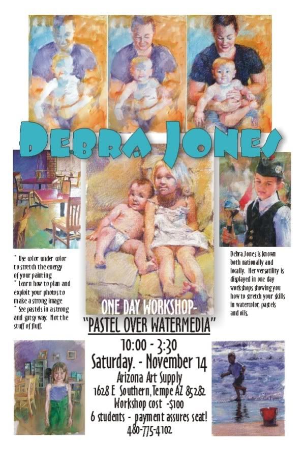
I will be doing a three day workshop covering the same subject in Prescott AZ next May, but you will hear more of that! Click to see it bigger....

Saturday, August 29, 2009
The Girl in the Yellow Dress - Planning
On a trip to Prescott Arizona to visit the Mountain Artist's Guild where I will be giving a workshop on my pastel techniques, I spent part of the afternoon in a historic part of town where children in period dress, played with hoops and croquet mallets! A perfect opportunity to snap a lot of marvelous reference for some nifty paintings.


My girl, with her straw hat and golden hair, was walking out of the shadow of her porch into the sun drenched day.
The first order of business is to make a basic drawing which will help me understand the areas that will stay light and go dark. The "cartoon" is what they called it in the good old days, is the most basic of basic notes to myself as the artist. This drawing of notation is not as easy as it looks.
Many artists will grid up a drawing, using squares which one super-imposes on the reference to match LARGER squares on the drawing. It is a bite size chunk approach of making something big and complex, smaller and manageable.
Others use projectors, either old fashioned slides, small opaque projectors or other fancy tools.
Still others reprint the photo is sections to the exact size they will be drawing.... the TRICK is to make useful lines.
Some of my students will outline everything they can imagine. The key is imagine! Lots of what is in the reference is not actually visible. A real problem is often an eye, that will end up outlined and pupil and tear duct all shown, when the actual photo is merely lights and darks.
A really useful sketch should help you abstract the areas of light and dark, and let you sort o short hand your soft and hard edges. AS THE ARTIST, you should always... one of my pet peeves.... always have some idea when you start, how you will end. I tend to be a bit A.D.D. in things so when I start, I often skip way ahead and dive in quickly, but I will say, my very BEST work may not ACTUALLY have a color sketch or plan, but there are hours spent on my computer playing with values and colors before I pick the aspects of the picture I want to do.
So this final drawing was done, not directly from the picture, but from tracings to ELIMINATE things. The less detail in the underdrawing, the stronger the shapes and masses, the better it functions:
The lighter drawing done in vine charcoal, is reinforced with compressed charcoal. When I have played my strategy in my head of what I am going to do next, I spray it to secure it with a fixative. And as you know, there is a reason for this.
In this piece, I will use my underpainting to get a running start at some of those darks in the shadows behind. I am also not going to get too creative in my use of complements. I am going to use yellow in yellow and splashes of local color mostly to give a lot more vitality to the yellows of the picture.
The general look of the underpainting, which began with a sludge of all over burnt sienna left some of the white of the paper for the whites in the dress and just builds darker tones to start with.
Not a very pretty sight.... Glumps of color and pretty insipid. YOU are not the only ones anxious to see me put color in...
As much as I hate to break this up upside down again, I think it is best to publish as I go. I might finish it tonight, but more fun letting you read so far!
dj*
Tuesday, August 25, 2009
FRUGAL NOTE
Just because I started the blog to brag how cheap I am....
This is over at the framer now. I have a great guy who does back flips for me. One of the best ways to save money is on your framing.
1. LET THE CLIENT FRAME IT!
the very best way when doing commissions. I never estimate a piece, no matter what, to include the frame. I will hand deliver it to the framer and let him take it from there, adding the cost after payment is received. NOT MY JOB
2. Work in a standard size.
If you are going to have to hang it on a wall for a while visiting, it really is hard to make a choice between a lot of money for very good show, and generic to let the piece show. Standard sized frames on sale, load up, have handy and work TO a size. Framing is always a sticker shock.
3. Establish a rapport with a framer and see what the scrap pile looks like.
My guy often goes through his molding ends and puts little standard frames together which he sells at a real discount. I still cover the glass and matting, but even if I pulled down my mat cutter, a PRO is going to be worth the money.
4. Slide 'em in, slide'em out.
I have this getting framed for a show on Tuesday. I asked the framer not to seal the back like he usually does, so I can remove this, as the odds of selling are pretty low, and recycle the show frame for other shows.
Frugal note done.
dj*
This is over at the framer now. I have a great guy who does back flips for me. One of the best ways to save money is on your framing.
1. LET THE CLIENT FRAME IT!
the very best way when doing commissions. I never estimate a piece, no matter what, to include the frame. I will hand deliver it to the framer and let him take it from there, adding the cost after payment is received. NOT MY JOB
2. Work in a standard size.
If you are going to have to hang it on a wall for a while visiting, it really is hard to make a choice between a lot of money for very good show, and generic to let the piece show. Standard sized frames on sale, load up, have handy and work TO a size. Framing is always a sticker shock.
3. Establish a rapport with a framer and see what the scrap pile looks like.
My guy often goes through his molding ends and puts little standard frames together which he sells at a real discount. I still cover the glass and matting, but even if I pulled down my mat cutter, a PRO is going to be worth the money.
4. Slide 'em in, slide'em out.
I have this getting framed for a show on Tuesday. I asked the framer not to seal the back like he usually does, so I can remove this, as the odds of selling are pretty low, and recycle the show frame for other shows.
Frugal note done.
dj*
Finish of Lucy and Milo
Sometimes I feel I get a bit wordy, so sometimes it is just time for a picture.
This is the whole thing done:

with some close ups:

You can see all the underlying colors both in paint and pastel and how they blend optically to make a rich flesh.

My intention was to make a stylistic and thematic interpretation of Mary Cassatt. I am so close. My strokes are nowhere near approaching the confidence I had hoped for, but subject and color use, I feel much closer.
Next demo is a generic ME... sorry, I am trying NOT to be too compulsive and post when I feel like it - not turn it into a chore.
So, I will try to do the next one all at one time.
THANK YOU FOR LOOKING!!
This is the whole thing done:
with some close ups:
You can see all the underlying colors both in paint and pastel and how they blend optically to make a rich flesh.
My intention was to make a stylistic and thematic interpretation of Mary Cassatt. I am so close. My strokes are nowhere near approaching the confidence I had hoped for, but subject and color use, I feel much closer.
Next demo is a generic ME... sorry, I am trying NOT to be too compulsive and post when I feel like it - not turn it into a chore.
So, I will try to do the next one all at one time.
THANK YOU FOR LOOKING!!
dj*
Saturday, August 22, 2009
Lucy and Milo
My friend Lucy and I spent a great afternoon snapping away like Paparazzi, getting photos of real kids doing real things. Mostly fidgeting and fighting... and being very very sweet.
The reference for Milo and his mom looked very Madonna and Child, and... as luck would have it... very Mary Cassatt.
My art league is having a contest called "In the Manner Of..." and I toyed with some Winslow Homer ideas in watercolor but the more I looked the more I was not up to the task. So these great pink children inspired my attempt at Mary Cassatt, who along with Degas were the two memorable Impressionist pastel painters. Mary was well known for her mothers and beautiful half naked kids! So Milo and Lucy were my inspiration.
This is not my first try. I will show that in another post, but this larger piece on 1/2 sheet of 140# watercolor paper, donated to me by Lucy from a stack of paper her mother, also an artist, had left her. Taped and sketched, I use my old set of Marie brand watercolors, found by a friend in a rental they had cleaned before leasing out!! The low quality of the paints is actually part of my process.
When I plan an underpainting, I try to think where I want to use complements and where I want to support the color. In this piece I knew I had to back off my values. The charm of the Mary Cassatt images was a flat flood of daylight over pink juicy baby bellies! No black and only one brown stick would I use...
Thinning the paints and loosely painting under the colors, not really sticking to the drawing, I like to make color passages under where the pastels will go.
Here is the underpainting:


I will show how I draw and redraw and pull the values into the baby's pink belly in my next post.
dj*
The reference for Milo and his mom looked very Madonna and Child, and... as luck would have it... very Mary Cassatt.
My art league is having a contest called "In the Manner Of..." and I toyed with some Winslow Homer ideas in watercolor but the more I looked the more I was not up to the task. So these great pink children inspired my attempt at Mary Cassatt, who along with Degas were the two memorable Impressionist pastel painters. Mary was well known for her mothers and beautiful half naked kids! So Milo and Lucy were my inspiration.
This is not my first try. I will show that in another post, but this larger piece on 1/2 sheet of 140# watercolor paper, donated to me by Lucy from a stack of paper her mother, also an artist, had left her. Taped and sketched, I use my old set of Marie brand watercolors, found by a friend in a rental they had cleaned before leasing out!! The low quality of the paints is actually part of my process.
When I plan an underpainting, I try to think where I want to use complements and where I want to support the color. In this piece I knew I had to back off my values. The charm of the Mary Cassatt images was a flat flood of daylight over pink juicy baby bellies! No black and only one brown stick would I use...
Thinning the paints and loosely painting under the colors, not really sticking to the drawing, I like to make color passages under where the pastels will go.
Here is the underpainting:
You see my basic set up. There are the NuPastels, pastel pencils, a tin full of rice to clean them and a small inexpensive but really nice quality soft pastels that I like to use to juice things up.
I like to store the long sticks, the green sticks, the less than used extra sticks in the rice. This, as you can see, is very well used. I throw the dirty sticks in and shake them up and most of the stray dust falls off and I find that I have MANY LESS BROWNS and a lot more lovely bright colors. My box contains most of my favorite small sticks, broken and somewhat organized to use easily an portably.
The underpainting was designed to keep a long cool tone through the baby, and a dark, but colorful contrast in the mother's shirt. Although it was black, my first attempt featured it much too strongly and I was determined to use no black in this. My darkest darks were mixtures of dark indigo, dark burnt umber and deep purple sticks.
I start by seeing what areas I need to redraw and will put in scrubs of light next to dark colors to establish value ranges..
I wanted to be sure there were very few outlines and strong hard edges. Finding Mom's eyebrows and placing them all in proportion were important, but as you see, the hair is starting in violets and browns.
I then try to build lights and darks, trying to keep the colors less relevant that their values. I use very light blue-greens, and yellows along with lavenders and pink in the skin tones. Colors that need dulling and brightening will be lightly hatched with white or gray that can lift it to the proper tone. This hatching and over hatching creates a blended surface, full of color.I will show how I draw and redraw and pull the values into the baby's pink belly in my next post.
dj*
Friday, August 21, 2009
The Lucy Series

Recently a few friends have helped me refresh some creative juices by volunteering to charge up my portrait (human) portfolio. The first group I want to post start with my friend Lucy and her marvelous kids, Kate and Milo.
I have observed that most portrait painters have a few glowing white-clad babes in their book. I love kids, but they are much like dogs. You do them a disservice by having them stiff and posed. They need energy and personality. Milo is a perpetual motion machine and Kate is a movie star.
I have plans to do a large oil of Kate, but the photo shoot and enthusiasm kept bringing me back to their images.
My first demo is not the first picture, but I want to show the short version of my watercolor paper technique.
The frugal part is the use of NuPastel. I am somewhat admired by people for my ability to squeeze out a monster range of color from these easy to buy, easy to use, relatively inexpensive hard pastel sticks. I like to blend color over color and use a lot of gray sticks to expand the range of the 48 or 92(?) colors in the box.
The second frugal part is the box of paints. I have a bucket of old acryics and watercolors that are drying up, taking up space, ready for the dumpster... but NOOO! I use them to make an underpainting for the pastel to follow to stretch the impact of the pastels.
The unfrugal part is my addiction to 300# watercolor paper. MOSTLY donated or scraps or the back of bad pictures, but I just love the stuff....
Above is a finish of Milo and Kate that was done in the technique. I THOUGHT I had my progress shots, but apparently not... so this is only what it ends up looking like. Demos to follow!
dj*
The First Post
This is my first posting in the blog.
So, in the cabin-fever summer here in Scottsdale, Arizona, I begin my diary.
I am a portrait painter and you can usually find me on blogger at my Dog A Day Artblog, an experiment in discipline. I committed to posting one dog portrait a day for at least a year. I am more than 2/3 through it and happily, can say there is a puppy face for every day since Thanksgiving!!!
BUT.
I am proficient in not only many subjects, but a lot of media. I have a number of workshops coming up in Arizona and out of state featuring my techniques. MOST of them based on working cheaply!
I am going to feature more narration on this page than my other blog so I may delete and regret more. I am not going to try to keep any strict posting schedule, but I encourage viewers and students and other artists to engage me in dialogue.
I have decided the blog will give me a good outlet to pick my own brain as I make pictures. As a teacher, I have always found I see a look of lobotomy in my class when I get on a tear! TOO MUCH INFORMATION seems to flicker in their eyeballs. I am hoping that this blog might be a way, after the workshops, for my students to let the information trickle in, after the demo, in a more gentle and less brain jarring manner.
So, in the cabin-fever summer here in Scottsdale, Arizona, I begin my diary.
Posts may be works in progress, dissections of old pieces, critiques of other artists or students.
We shall see!
Subscribe to:
Posts (Atom)