About Me

My photo
Portrait artist, fine artist, educator, student. Trying all means to keep from getting a day job in the tough times, but still supporting myself as an artist! deejaystar@yahoo.com Follow any and all of my blogs. THANK YOU!
Showing posts with label Art Teacher. Show all posts

Saturday, May 29, 2010

The Progress Shot

I wanted not to scare off the participants, so I did a couple more hours work on the demo. It is being refined for color and relationships. The photo may be updated when I re-photograph it in daylight, but for now, one can see it does actually not end up being abstract expressionistic, and can be refined quite nicely into recognizable realism:

dj*

Wednesday, September 9, 2009

Early Notice, I am giving a class.

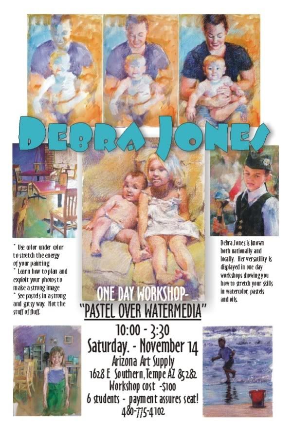
For the locals (or for anyone interested in hiring me anywhere) here is a preview of my class.
I will be doing a three day workshop covering the same subject in Prescott AZ next May, but you will hear more of that! Click to see it bigger....


Saturday, August 29, 2009

The Girl in the Yellow Dress - Planning

On a trip to Prescott Arizona to visit the Mountain Artist's Guild where I will be giving a workshop on my pastel techniques, I spent part of the afternoon in a historic part of town where children in period dress, played with hoops and croquet mallets! A perfect opportunity to snap a lot of marvelous reference for some nifty paintings.

My girl, with her straw hat and golden hair, was walking out of the shadow of her porch into the sun drenched day.
The first order of business is to make a basic drawing which will help me understand the areas that will stay light and go dark. The "cartoon" is what they called it in the good old days, is the most basic of basic notes to myself as the artist. This drawing of notation is not as easy as it looks.

Many artists will grid up a drawing, using squares which one super-imposes on the reference to match LARGER squares on the drawing. It is a bite size chunk approach of making something big and complex, smaller and manageable.

Others use projectors, either old fashioned slides, small opaque projectors or other fancy tools.

Still others reprint the photo is sections to the exact size they will be drawing.... the TRICK is to make useful lines.

Some of my students will outline everything they can imagine. The key is imagine! Lots of what is in the reference is not actually visible. A real problem is often an eye, that will end up outlined and pupil and tear duct all shown, when the actual photo is merely lights and darks.

A really useful sketch should help you abstract the areas of light and dark, and let you sort o short hand your soft and hard edges. AS THE ARTIST, you should always... one of my pet peeves.... always have some idea when you start, how you will end. I tend to be a bit A.D.D. in things so when I start, I often skip way ahead and dive in quickly, but I will say, my very BEST work may not ACTUALLY have a color sketch or plan, but there are hours spent on my computer playing with values and colors before I pick the aspects of the picture I want to do.

So this final drawing was done, not directly from the picture, but from tracings to ELIMINATE things. The less detail in the underdrawing, the stronger the shapes and masses, the better it functions:

The lighter drawing done in vine charcoal, is reinforced with compressed charcoal. When I have played my strategy in my head of what I am going to do next, I spray it to secure it with a fixative. And as you know, there is a reason for this.

In this piece, I will use my underpainting to get a running start at some of those darks in the shadows behind. I am also not going to get too creative in my use of complements. I am going to use yellow in yellow and splashes of local color mostly to give a lot more vitality to the yellows of the picture.

The general look of the underpainting, which began with a sludge of all over burnt sienna left some of the white of the paper for the whites in the dress and just builds darker tones to start with.
Not a very pretty sight.... Glumps of color and pretty insipid. YOU are not the only ones anxious to see me put color in...

As much as I hate to break this up upside down again, I think it is best to publish as I go. I might finish it tonight, but more fun letting you read so far!
dj*


Sunday, August 23, 2009

L & M pt. 2

ONE problem with blogs is that they sequence bottom to top.  I suppose I may join all the posts together when I get them up, but it is confusing when trying to show you a process...

So, last I had the basics of Lucy's head and skin.


Her adult skin tone was illuminated in interior incandescent from above and a flood of sun from the window on the side.  The two light sources are great for a color project.  Most of the light on my pink Milo belly will be the cooler tones that make for the un-tanned baby flesh I am dying to get into.


The blue splash under the skin tones, as you saw in the close up of Lucy, faintly colors the whole tone.  Building contrasts with more darks in the shirt against the shapes, and bringing colors from the background into the ears, and below the next, help break the isolation of the figures.  Light is what we use to see things, light is what helps us understand, and in art, bringing a sense of that light into areas near each other, gives a much more unified look.

I am trying very hard (not as successfully as I had hoped) to decrease the emphasis of line as the drawing.  Yep, the whole thing IS line... scratches and marks, skinny little lines, but they are being used for what pastels to the best:  building color next to pure color.  Much like pointillism.  The actual color that the eye understands ends up a mixture of all of those presented... so it looks like skin, even if it s blue and green and purple.


To that end, you will see I have reinforced the outlines of the hands and fingers, not with black or charcoal, but a nice low chroma lavender.  With luck I will let them stay light.


Milo is fleshing out.    I used my dark blue, deep Russian-like, and some of the light blue for the whites to show the contrast in the eyes.  I am trying to make a figurative, not a portrait painting here.  

I find I have a situation in my art.  I LOVE to do portraits.  I love to capture the essence of people and things, showing a lot more than appearance, but personality.  THIS picture is an attempt to directly learn a bit about the use of technique and feeling of the Mary Cassatt painting and keep myself within my own restrictions.  Milo is a great looking kid... and neither he nor Lucy actually look LIKE Lucy or Milo.  When I get the painting done, I will labor more on the likenesses if the subject thinks it is worth it.
I think I have a problem with this aspect of painting people because I am SO intrigued by the person.  I call it "Who wants to have a stranger watching you eat?"  I mean, while pursuing the likeness of people, I find their general appeal often is reduced.  To keep trying for the specific over the universal can eliminate a potential market.   Followers are REALLY WELCOME to post comments to support or deny me....
More to come....

Friday, August 21, 2009

The First Post

This is my first posting in the blog.

I am a portrait painter and you can usually find me on blogger at my Dog A Day Artblog, an experiment in discipline. I committed to posting one dog portrait a day for at least a year. I am more than 2/3 through it and happily, can say there is a puppy face for every day since Thanksgiving!!!

BUT.

I am proficient in not only many subjects, but a lot of media. I have a number of workshops coming up in Arizona and out of state featuring my techniques. MOST of them based on working cheaply!

I am going to feature more narration on this page than my other blog so I may delete and regret more. I am not going to try to keep any strict posting schedule, but I encourage viewers and students and other artists to engage me in dialogue.

I have decided the blog will give me a good outlet to pick my own brain as I make pictures. As a teacher, I have always found I see a look of lobotomy in my class when I get on a tear! TOO MUCH INFORMATION seems to flicker in their eyeballs. I am hoping that this blog might be a way, after the workshops, for my students to let the information trickle in, after the demo, in a more gentle and less brain jarring manner.

So, in the cabin-fever summer here in Scottsdale, Arizona, I begin my diary.

Posts may be works in progress, dissections of old pieces, critiques of other artists or students.
We shall see!